For mobile food vendors and brick-and-mortar cafes, the menu board is more than a list of prices—it is your primary salesperson. A poorly designed board confuses customers and slows down lines. A great one increases average order value and enhances brand loyalty.
Whether you operate a food truck or a cozy coffee shop, understanding how to optimize your food truck menu boards and cafe menu board design is essential for success.
Food Truck Menu Boards: Small Space, Big Impact
Food trucks face a unique challenge: limited physical space and extremely fast transaction times. Customers often approach a truck already hungry and impatient. Your food truck menu board must communicate value, variety, and price in under 10 seconds.
Best Practices for Food Truck Boards
Keep it concise: List only 6–8 core items. Too many choices cause “decision paralysis.”
Use high-contrast colors: Black backgrounds with neon or white text are readable in direct sunlight.
Highlight a signature item: Use a star or box around your best-selling dish to guide the eye.
Display prices clearly: Avoid small font sizes. Rounded prices (8���������7.95) speed up mental math.
Material Matters for Mobile Units
Food truck boards face vibration, weather, and grease. Many owners opt for chalkboard-style panels (easy to rewrite daily specials) or weatherproof PVC signs. However, a growing trend is the small-format digital screen (21–32 inches) running on 12V power from the truck’s battery. These allow real-time changes when you run out of an ingredient.
Cafe Menu Board: Creating Ambience and Urgency
A cafe menu board serves a dual purpose: informing customers and reinforcing the cafe’s atmosphere. Unlike food trucks, cafes often have repeat customers who appreciate seasonal rotations and handwritten charm.
Layout Strategies for Coffee Shops
Group by category: Espresso drinks, brewed coffee, tea, pastries, and food. Use horizontal lines or different background colors.
Place high-profit items at eye level: Specialty lattes (6.50)�ℎ���������������������(3.00).
Use descriptive language: Instead of “Ham Sandwich,” write “Smoked Ham & Aged Gouda on Baguette.”
Include a “featured” section: Rotate a single seasonal drink (e.g., Pumpkin Spice Latte in fall) with a small illustration.
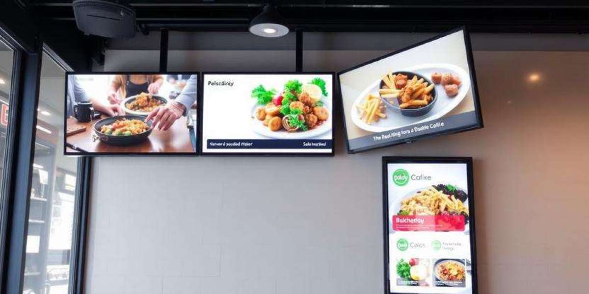
Traditional vs. Digital Cafe Boards
Many cafes prefer chalkboard or magnetic letter boards for their rustic aesthetic. These work well if staff update them daily. However, digital cafe menu boards (32–43 inch screens) offer advantages:
Dayparting: Automatically switch from breakfast pastries (8 AM) to lunch sandwiches (12 PM).
Upsell integration: Show a pastry image when someone orders a cappuccino.
No mess: No chalk dust or smudges.
Common Mistakes to Avoid (Both Trucks & Cafes)
Whether you design a food truck menu board or a cafe menu board, these errors hurt sales:
Too much text: If customers step out of line to read, your board is overcrowded.
Illegible fonts: Script or cursive fonts might look cute but frustrate hungry people. Stick to sans-serif (Helvetica, Arial, Open Sans).
No visual hierarchy: All items look the same size and weight. Use bold headers and larger fonts for featured items.
Forgetting the “call to action”: Add small icons like a coffee cup or taco to draw attention.
Technology Upgrades to Consider
For food trucks, a QR code on the menu board can link to an online pre-order page, reducing wait times. For cafes, integrating the digital board with your POS system allows automatic price updates and inventory tracking.
Even low-tech solutions work. A simple LED light strip illuminating a chalkboard can increase readability by 40% during evening hours.
Conclusion: Clarity Drives Revenue
Your food truck menu board and cafe menu board are direct reflections of your brand. A clean, organized, and visually appealing board reduces wait times, minimizes employee frustration (“We’re out of that…”), and increases average ticket size through strategic placement of profitable items.
Start by auditing your current board from a customer’s perspective. Is the most popular item visible within three seconds? Can a person with glasses or low light read it easily? Make those fixes today, and watch your daily sales climb.
Pro tip: Test two versions of your board on different days. Track which layout leads to higher sales of specialty items. Data never lies.